Difference between revisions of "Images for inspiration and use"
| Line 1: | Line 1: | ||
| + | the idea of this collection is not to use them directly, but get some ideas. | ||
| + | I think drawing / tracing / copying / making collages + fragments is necessary to built some new coherent and R+R specific visual lingo. | ||
| + | |||
| + | |||
[[Image:doorsnede.jpg]] | [[Image:doorsnede.jpg]] | ||
| Line 14: | Line 18: | ||
not to forget the beauty of simplicity | not to forget the beauty of simplicity | ||
| − | [[Image:Doventekens.jpg]] | + | [[Image:Doventekens.jpg]] [[Image:Tekeningen.jpg]] |
This is a belgian fr. keyboard scripted to translate letters to signs for deaf people | This is a belgian fr. keyboard scripted to translate letters to signs for deaf people | ||
| − | -- some great signs / symbols can be found on signbank.org | + | -- some great signs / symbols can be found on signbank.org. The other image shows the signs drawn by a deaf student. |
[[Image:Headshake.jpg]] [[Image:Handshake.png]] | [[Image:Headshake.jpg]] [[Image:Handshake.png]] | ||
Inventing new routines includes looking at how people meet and approach / maybe en route we will develop some new templates for behaviour. Handshakes, greeting words / curses / ... | Inventing new routines includes looking at how people meet and approach / maybe en route we will develop some new templates for behaviour. Handshakes, greeting words / curses / ... | ||
Revision as of 18:37, 2 May 2006
the idea of this collection is not to use them directly, but get some ideas. I think drawing / tracing / copying / making collages + fragments is necessary to built some new coherent and R+R specific visual lingo.
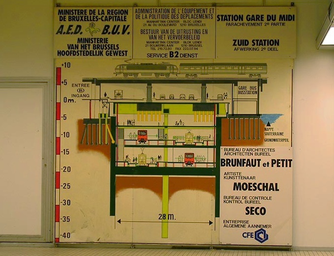
this drawing, or rather the whole layout of the info board could be a great model for a poster / flyer. Since Routes and Routiines is very much about mapping from a different perspective, visualising a querschnitt / doorsnede / view of the many layers of a location / situation seems very appropriate. I love how the info is grouped around the drawing, theout of propoportion bold and italic typo, the corny pastel teints and the many spelling mistakes
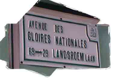
the figurative framing / suggestive silhouette implies a narrative beyond the directly visible
not to forget the beauty of simplicity
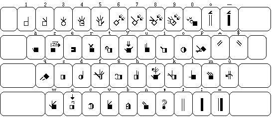
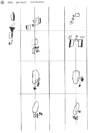
This is a belgian fr. keyboard scripted to translate letters to signs for deaf people -- some great signs / symbols can be found on signbank.org. The other image shows the signs drawn by a deaf student.
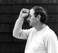
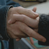
Inventing new routines includes looking at how people meet and approach / maybe en route we will develop some new templates for behaviour. Handshakes, greeting words / curses / ...
