Difference between revisions of "Images for inspiration and use"
From Drafts
| Line 12: | Line 12: | ||
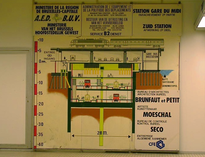
[[Image:metrobord.jpg]] | [[Image:metrobord.jpg]] | ||
| − | not to forget the beauty of | + | not to forget the beauty of simplicity |
Revision as of 17:54, 2 May 2006
this drawing, or rather the whole layout of the info board could be a great model for a poster / flyer. Since Routes and Routiines is very much about mapping from a different perspective, visualising a querschnitt / doorsnede / view of the many layers of a location / situation seems very appropriate. I love how the info is grouped around the drawing, theout of propoportion bold and italic typo, the corny pastel teints and the many spelling mistakes
the figurative framing / suggestive silhouette implies a narrative beyond the directly visible
not to forget the beauty of simplicity


