Difference between revisions of "Images for inspiration and use"
| Line 45: | Line 45: | ||
[[Image:doorgang.jpg]] | [[Image:doorgang.jpg]] | ||
| − | Locatie Zaadstraat / Ninoofse steenweg | + | Locatie: Zaadstraat / Ninoofse steenweg |
[[Image:troon.JPG]] | [[Image:troon.JPG]] | ||
Lieu: jonction Rue Gray / Troon | Lieu: jonction Rue Gray / Troon | ||
| + | |||
| + | [[Image:Raam.jpg]] | ||
| + | |||
| + | Location: kruising Gray straat / rue throne | ||
Revision as of 22:19, 2 May 2006
The purpose of this collection is to get some ideas. The foto's themselves are not that important, and I think it would be best not to use them, but to transpose concepts into self made images / design.
Drawing / tracing / copying / making collages + fragments + photographic cut outs?
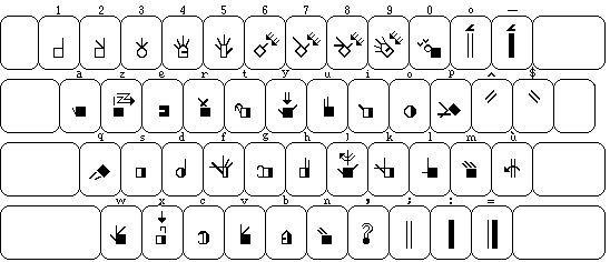
This is a belgian fr. keyboard scripted to translate letters to signs for deaf people
-- some great signs / symbols can be found on www.signbank.org
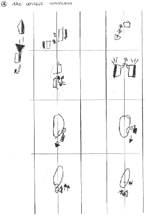
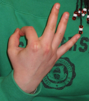
The other image shows the same signs drawn by a deaf student.
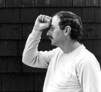
Inventing new routines includes looking at how people meet and approach / maybe en route we will develop some new templates for behaviour. Handshakes, greeting words / curses / ...
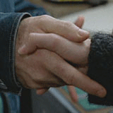
Finnish rappers usually praise their own neighborhoods, although with a little less passion. However, where hip-hop is concerned, your telephone area code is nowadays important in Finland as well. People living in Tampere have even created a finger sign which symbolizes the numbers 03, the area code of Tampere, and resembles the different signs that American rappers have for east side and west side and for their crews. (www.uta.fi)
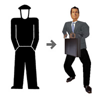
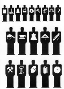
Otto Neurath model with extrapolated live action position, + isotype figures with trade symbols in silhouets
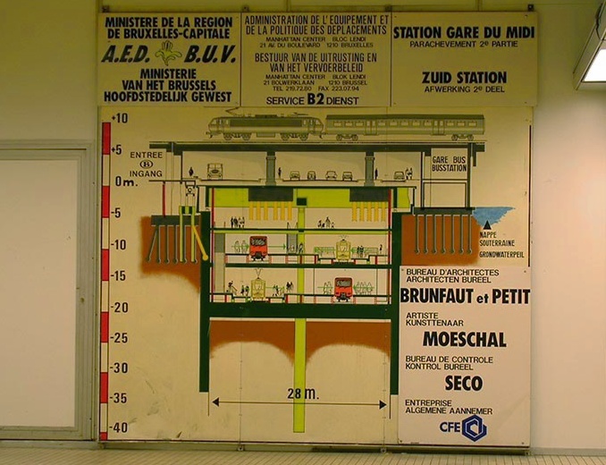
this drawing, or rather the whole layout of the info board could be a great model for a poster / flyer. Since Routes and Routiines is very much about mapping from a different perspective, visualising a querschnitt / doorsnede / view of the many layers of a location / situation seems very appropriate. I love how the info is grouped around the drawing, theout of propoportion bold and italic typo, the corny pastel teints and the many spelling mistakes
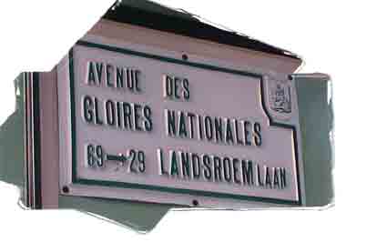
the figurative framing / suggestive silhouette implies a narrative beyond the directly visible
not to forget the beauty of simplicity
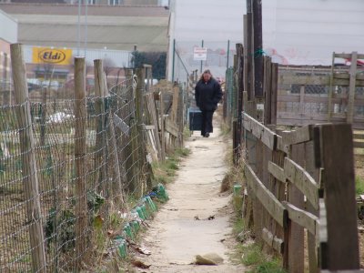
Locatie: Zaadstraat / Ninoofse steenweg
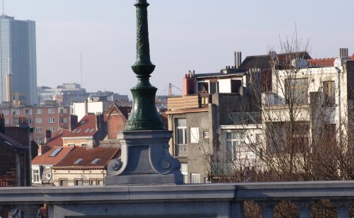
Lieu: jonction Rue Gray / Troon
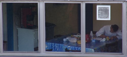
Location: kruising Gray straat / rue throne
